Dan Baroody

Portfolio

Twelve years owning the product design of an enterprise analytics platform across web, mobile and desktop, plus the work that came before. Each line is a problem someone had. Open it to see what I made.

Client names and figures in the Salient screens are placeholders.

Organize by
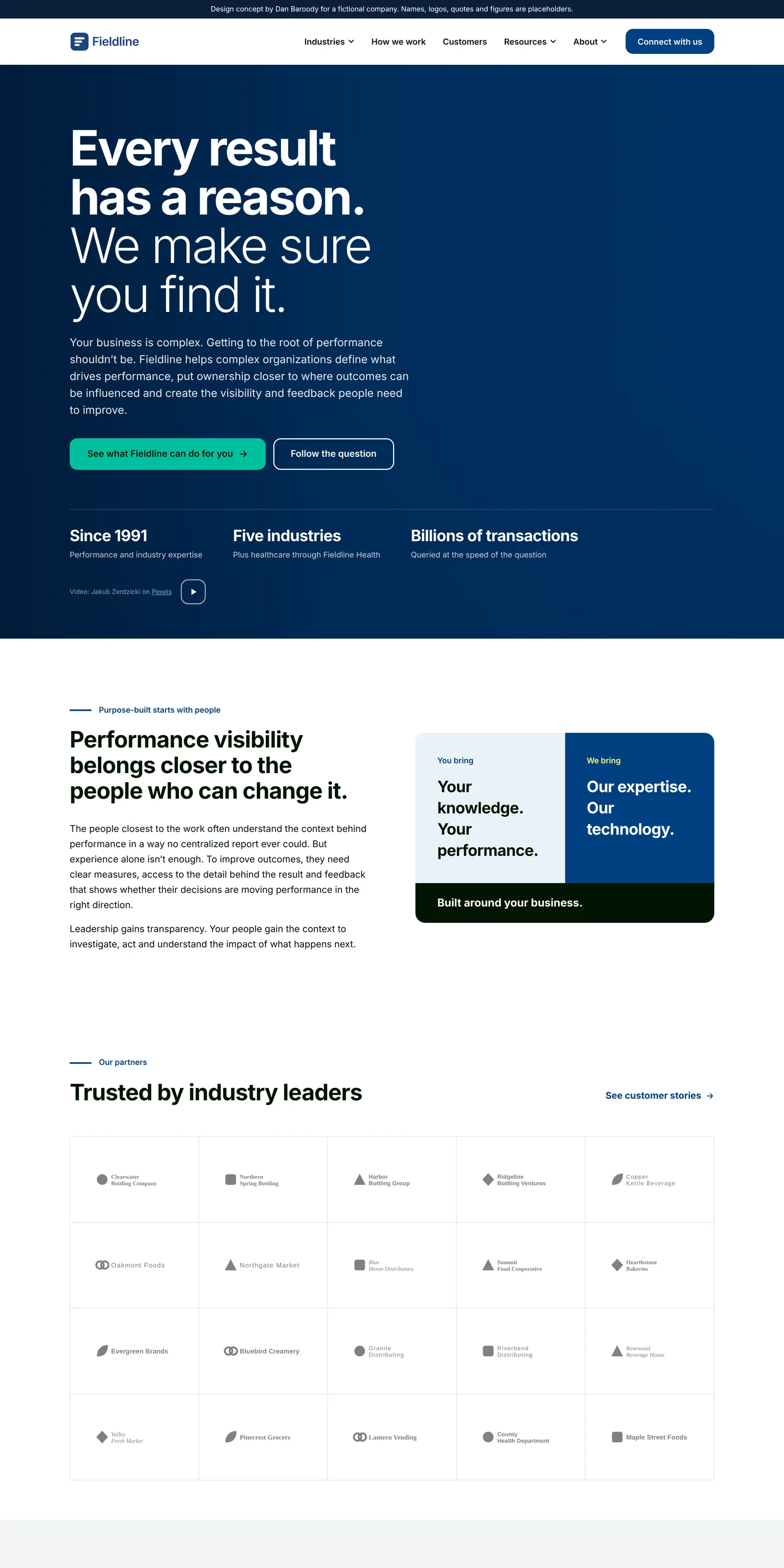
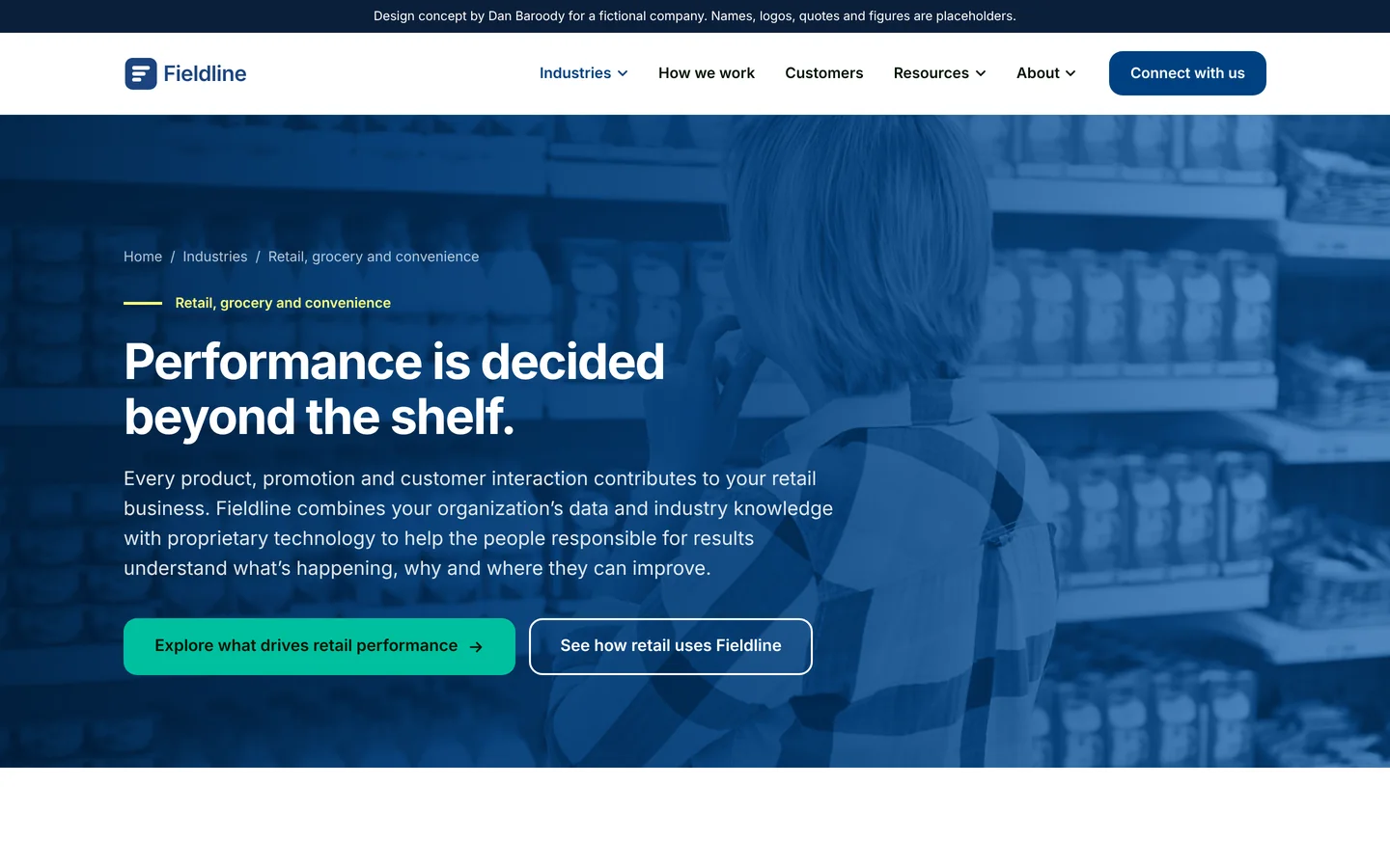
One company website has to speak to six different industries. Fieldline website concept Concept

A 15-page marketing site for a fictional business-performance software company: home, six industry pages, customers, how we work, careers, a resource guide, blog and contact. Hand-built in HTML, CSS and JavaScript, with shared templates so the header, menu and footer stay identical on every page.
Comparing date ranges on a chart opened a separate window for every range. Range Summary window Salient

One window now holds every range picked on a trend chart, side by side. Each range is shaded on the chart while the window is open, and a differences view does the math between them.
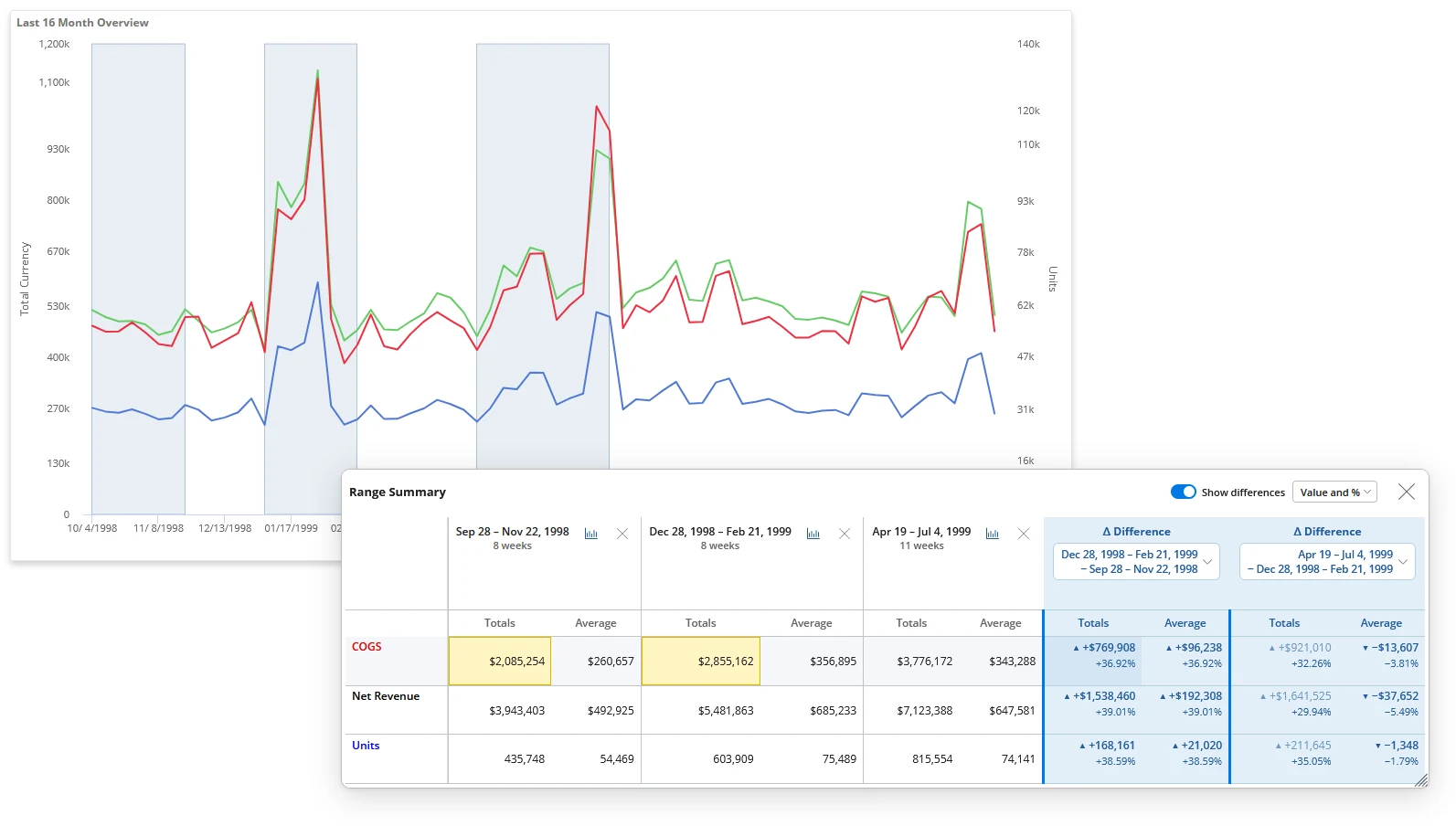
Range Summary window over a trend chart: three shaded ranges on the chart and a table comparing COGS, net revenue and units across them, with two blue difference columns.
Nobody could find a dashboard unless they knew who saved it and where. Directory redesign Salient

Search comes first. Bookmarks and dashboards are separated, and people choose how much detail each card shows.
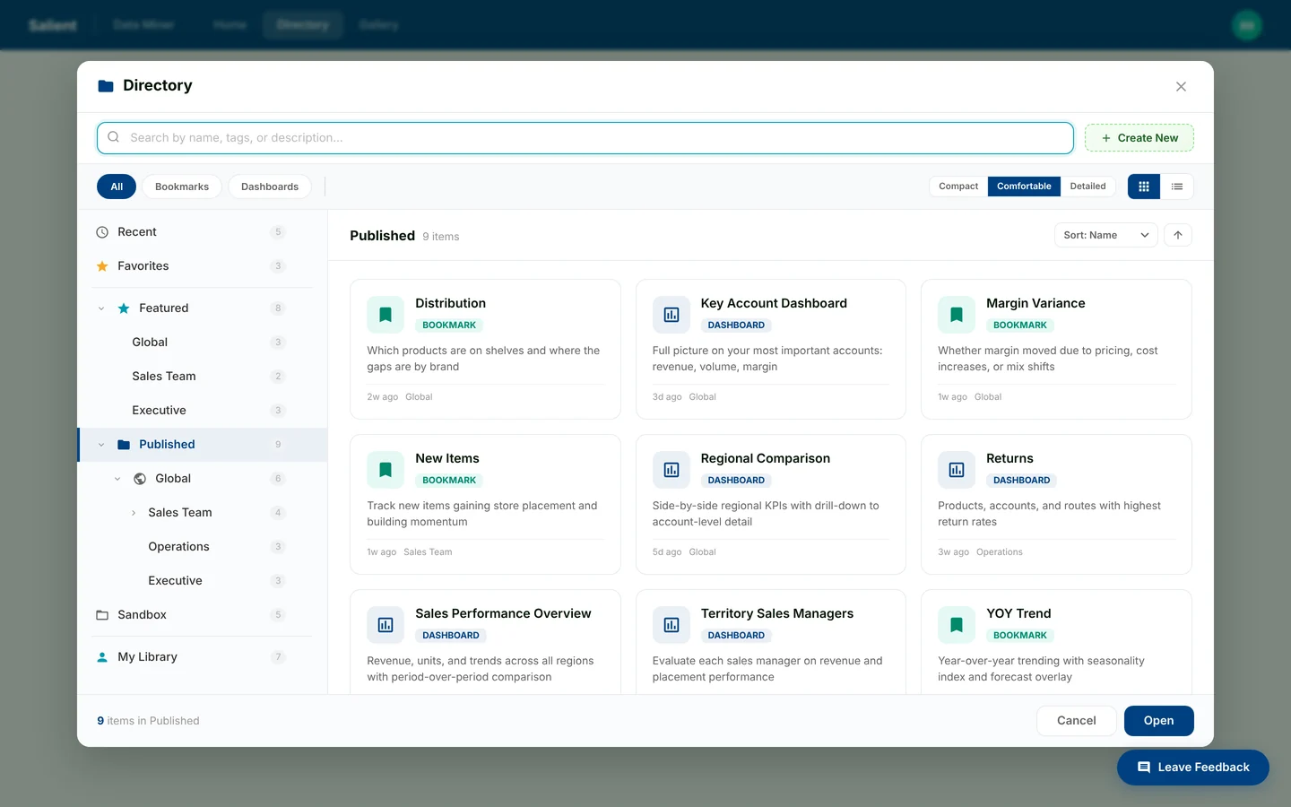
Directory dialog: folder tree on the left, search across the top, and a grid of dashboard and bookmark cards.
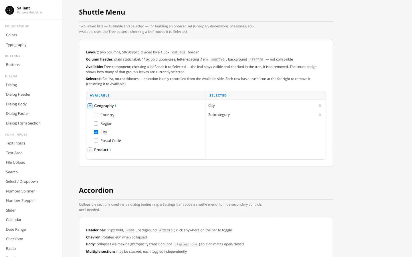
Every setup dialog worked a little differently, so people had to relearn each one. Configure dialog Salient

Group by, measures, date ranges, filters and options in one dialog with one shared pattern: available on the left, selected on the right.
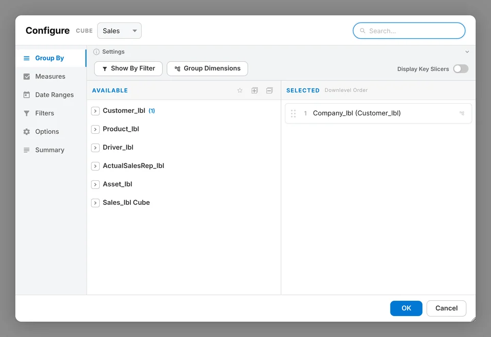
Configure dialog with tabs for Group By, Measures, Date Ranges, Filters, Options and Summary, and available and selected lists side by side.
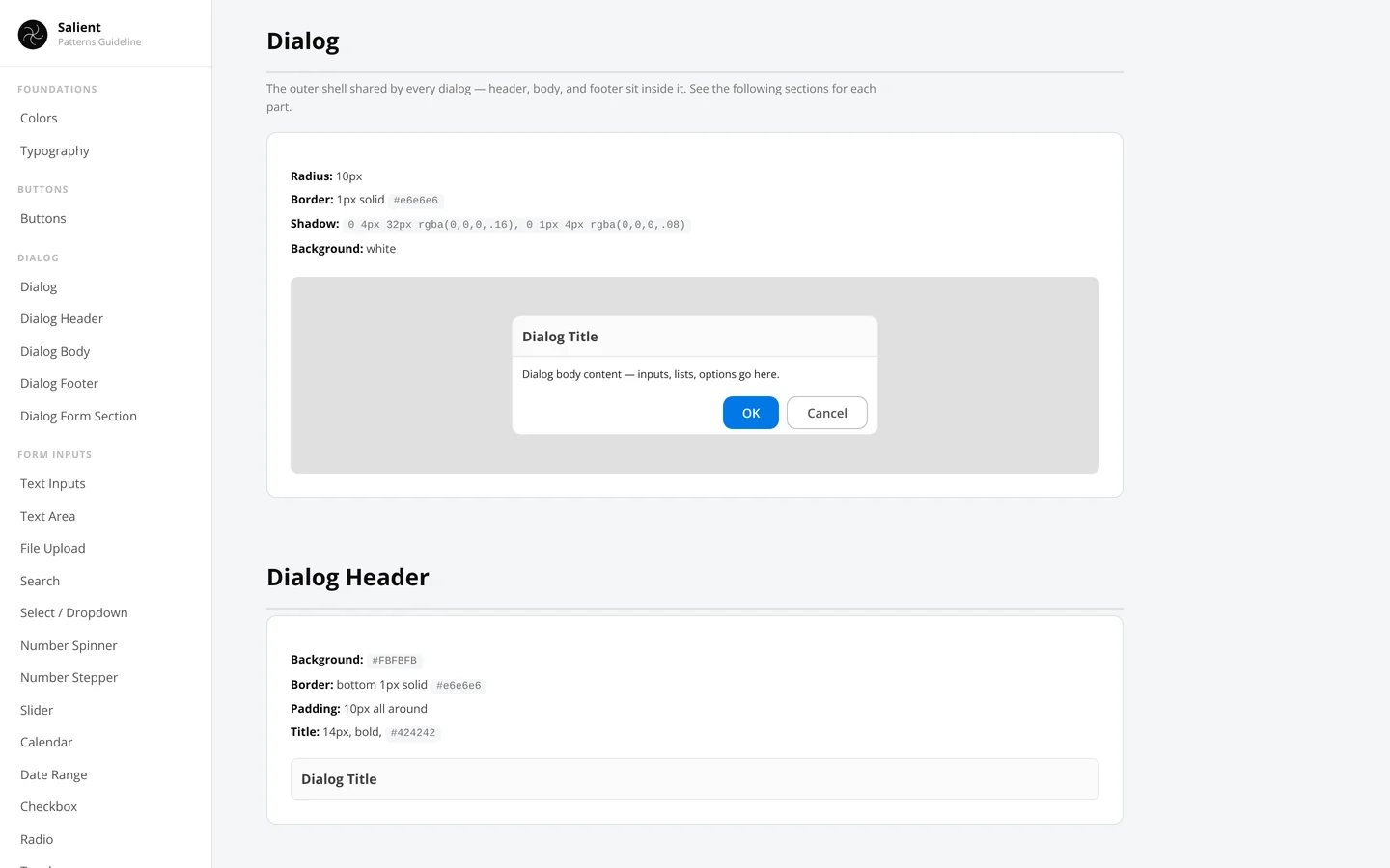
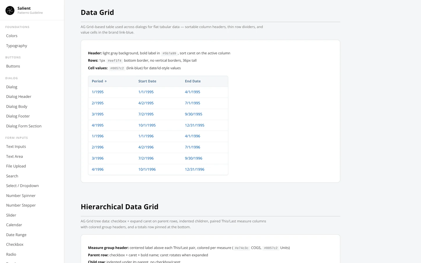
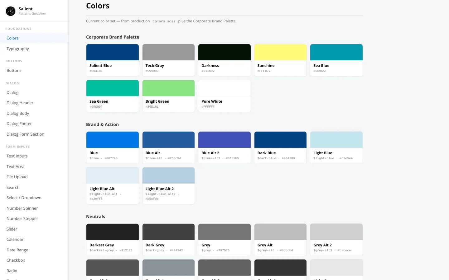
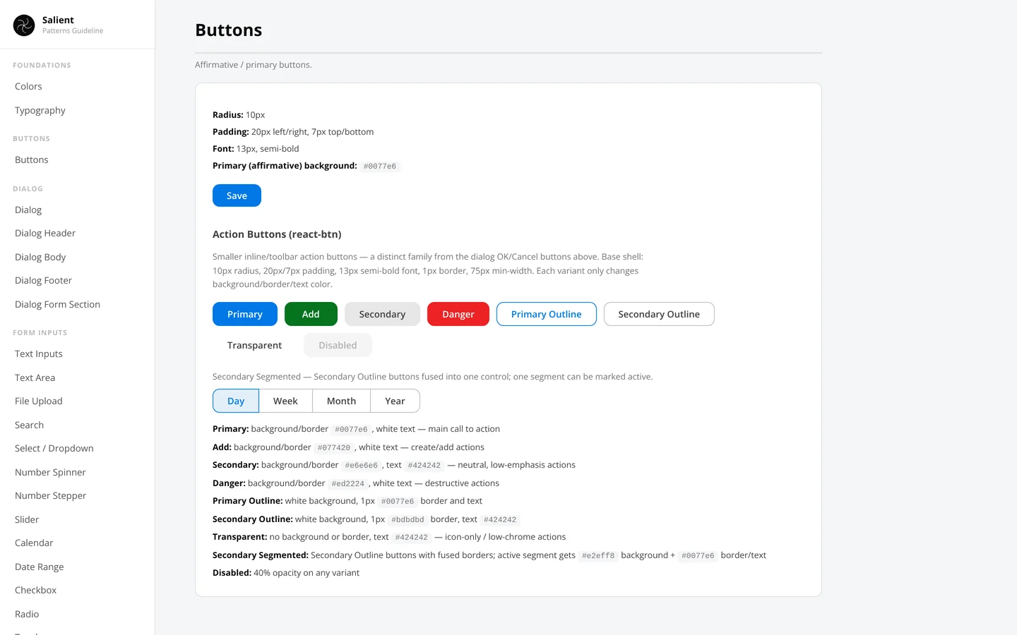
Developers were guessing at colors, spacing and button states. Design system Salient

Color, type, buttons, form controls and a single-weight icon set, documented so new screens get built the same way every time.
Sometimes creativity needs a spark. Creative Spark dodill

Two random words, and a refresh button for more. Use them to start a story, a sketch, a poem or a conversation. The only rule is to make something that's yours.
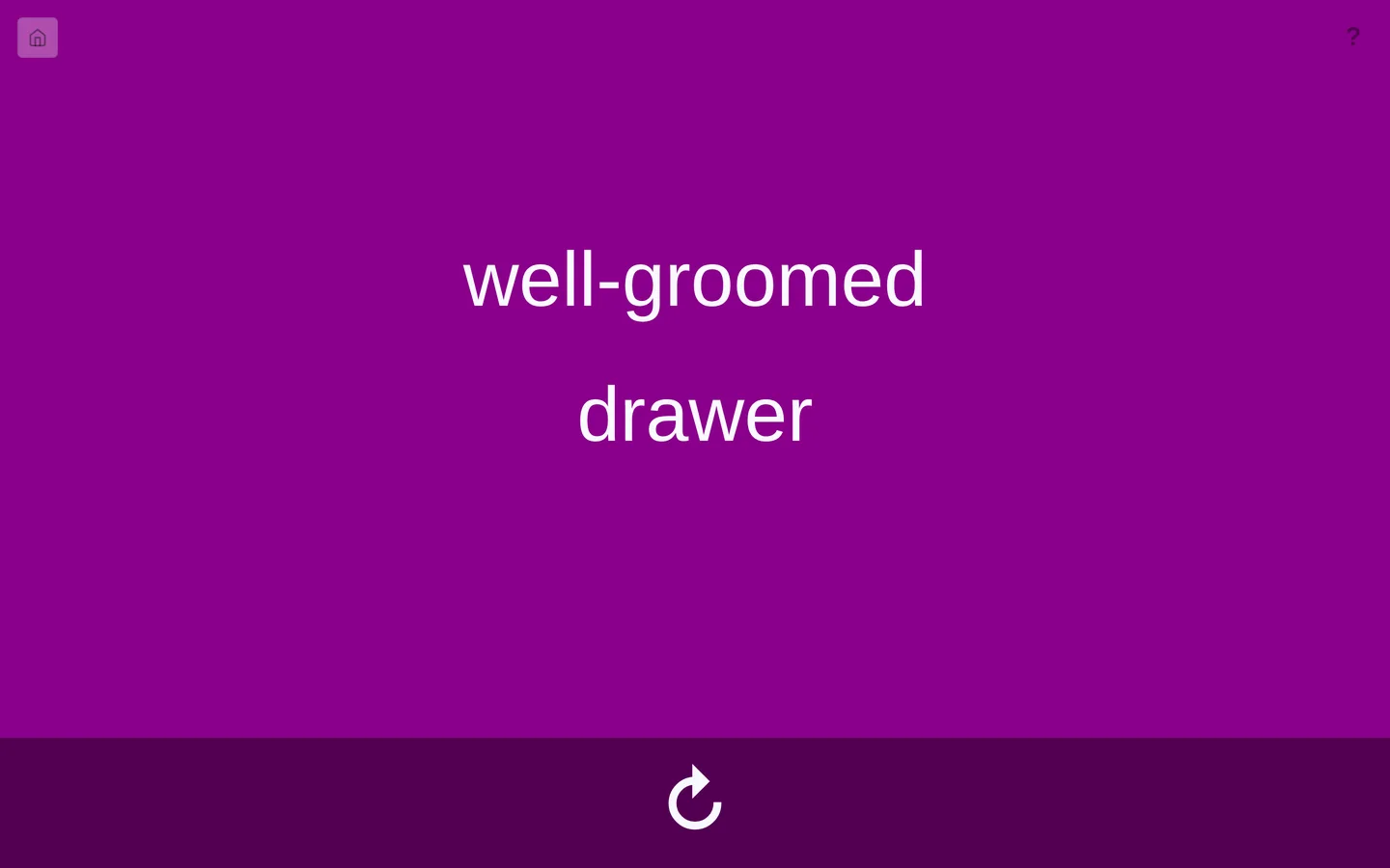
Creative Spark: the words well-groomed and drawer in large white type on a purple background, with a refresh button below.
Transferring a reference image to a canvas at the right size. Image Grid Tool dodill

Upload an image, set the canvas size in inches and DPI, position the image, then lay a grid over it with your own rows, columns, line color and weight. Save the result and print it.
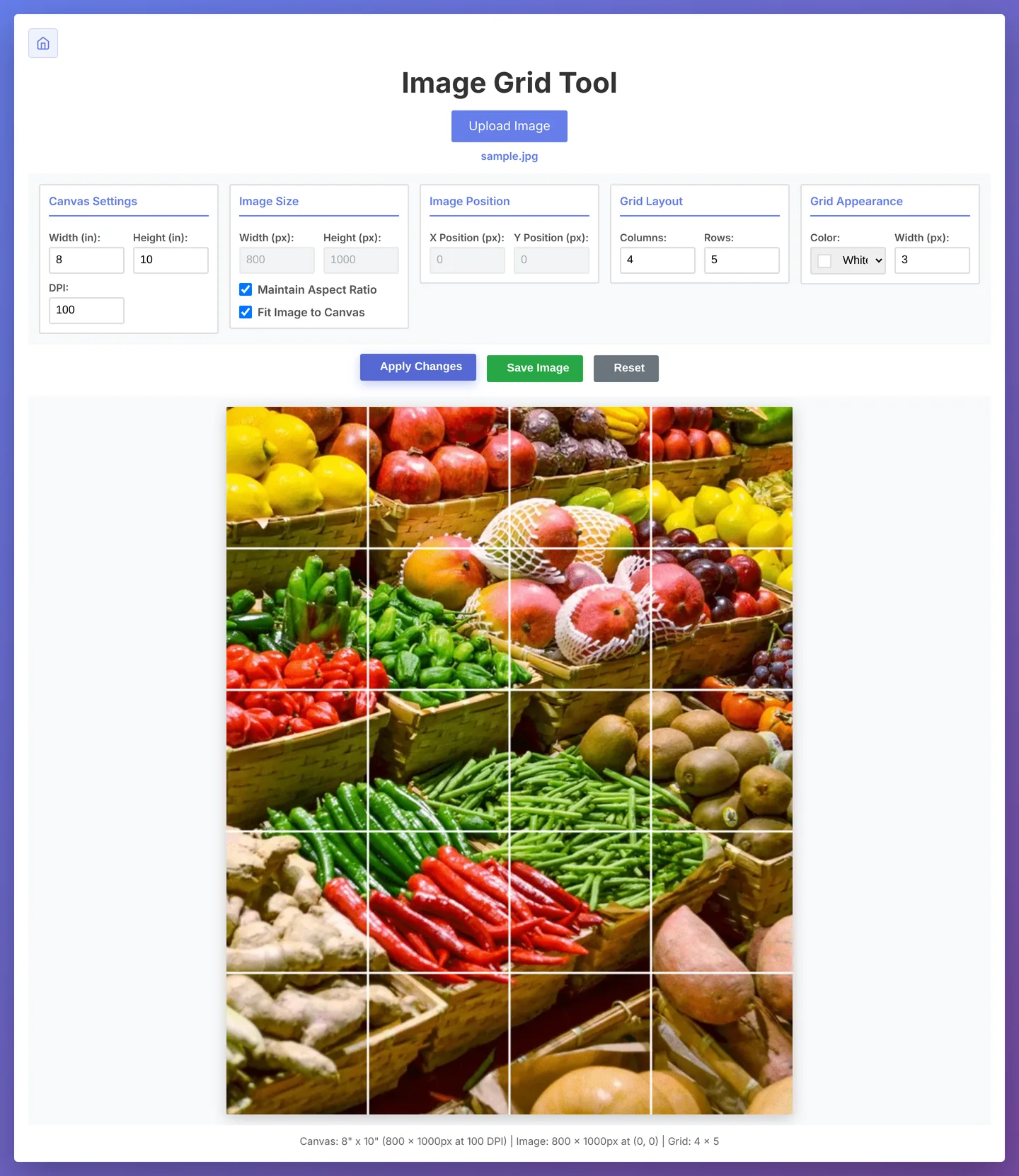
Image Grid Tool: canvas, image size, position, grid layout and grid appearance controls above a photo of a produce market divided by a white four by five grid.
Pulling a usable color palette out of an image. Color Palette Maker dodill

Generate a palette at random or extract one from an uploaded image. Lock the colors you like, regenerate the rest, and export in HEX, RGB or HSL.
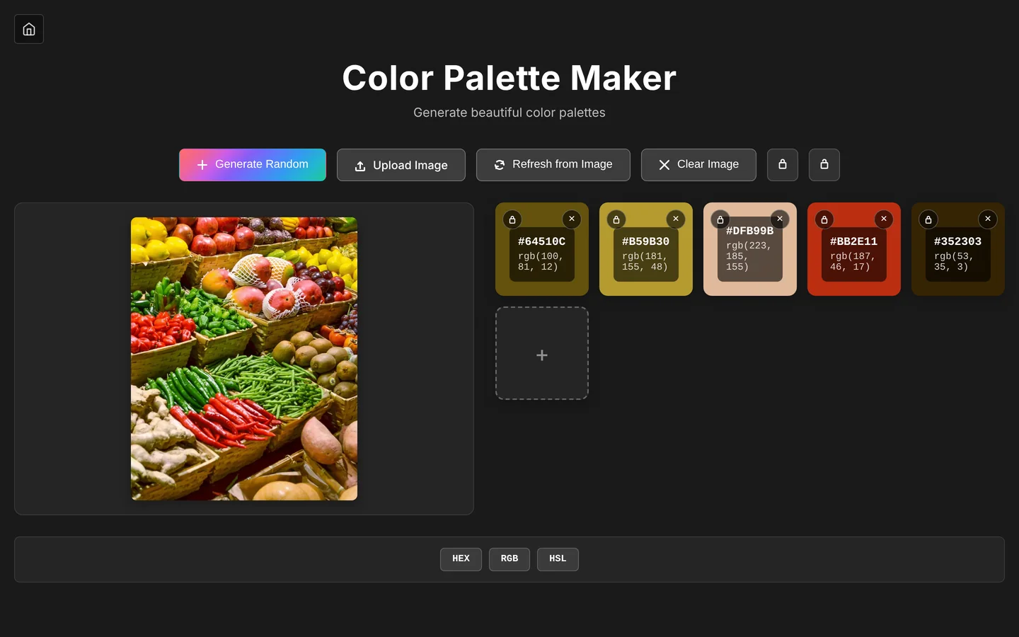
Color Palette Maker: a produce market photo beside five extracted swatches, from olive and mustard to peach, red and dark brown, each with HEX and RGB values.
A college with no presence on social media. Founded every social channel Elmira College

Created the college's first Facebook, Twitter, YouTube and Instagram accounts. From there I developed new messaging and new ways to grow our reach, bringing in the community, lapsed alumni and new students through a mix of channels. The result was an increase in donations and in engagement across every audience.

Elmira College's YouTube, Facebook and Instagram pages, fanned out in a stack.
A college website that wasn't working for prospective students. Website redesign Elmira College

Led the full redesign of the college website. The new design focused on ease of use: finding what you came for in fewer clicks, with the most important parts of the college easier to see.
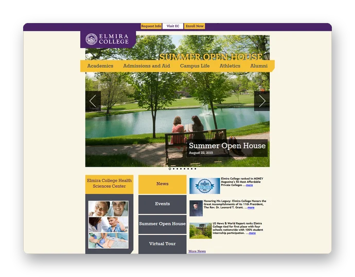
The redesigned Elmira College home page: purple and gold navigation, a Summer Open House photo slider, and news and events below.

Salient, product design

Range Summary window

The problem

Analysts pick date ranges on a trend chart to compare periods, like this fall against last winter. Each range opened its own floating window. Comparing three periods meant juggling three windows, reading numbers across them by eye, and doing the subtraction in your head. Windows could also stay open after their chart was gone.

What I made

  • All ranges live in one window, with a Swap view option to flip rows and columns.
  • Selected ranges are shaded on the chart and update the moment one is added or removed.
  • Show differences adds later-minus-earlier comparisons. Any pair can be chosen, swapped or removed, shown as values, percent change, or both, grouped at the end or beside each range.
  • Differences read the way the source numbers do: same units, an up or down arrow, and percentage rows in points rather than a percent of a percent.
  • When two ranges have different lengths, Totals differences are greyed out because they mostly reflect the length. Averages stay normal.
  • Headers show readable dates, the comparison period and the range length, like "Dec 28, 1998 – Feb 21, 1999, 8 weeks".
  • Everything works from the keyboard, with screen-reader labels built from the dates and no switch animation when reduced motion is on.
  • The window closes with its chart every time, so no more orphaned windows.

Elmira College, web design

College website redesign

The problem

Prospective students and their families came to the site with specific questions: how to visit, how to apply, what it costs. The answers were there, but they took too long to find, and the things that set the college apart were easy to miss.

What I made

  • A new design built around ease of use, so visitors find what they came for in fewer clicks.
  • Menus grouped by what people are trying to do, like Visit, Apply, and Tuition and Financial Aid, instead of by how the college is organized.
  • Calls to action like Apply and Visit pinned to the top of every page.
  • Important parts of the college, like news, events, open houses and the virtual tour, given room on the home page.
  • A consistent page layout with breadcrumbs and section menus, so visitors always know where they are.

Personal project, web design

Fieldline website concept

The problem

A software company sells to six very different industries, from grocery chains to beverage distributors to healthcare. One website has to make sense to all of them without turning into a generic brochure.

View the concept (opens in a new tab)

What I made

  • 15 pages: home, an industries overview, six industry pages, customers, how we work, about, careers, a resource guide, blog, events and contact.
  • A shared mega menu, header and footer generated from templates, so every page stays consistent and new pages are quick to add.
  • Industry pages that lead with each audience's own problem before talking about the product.
  • Hand-built in HTML, CSS and JavaScript with no framework, responsive down to phones.
  • Names, logos, people and figures are all placeholders for a fictional company.

Salient, product design

Directory redesign

The problem

Finding a dashboard meant knowing who saved it and which folder they used. Bookmarks and dashboards were mixed together, and there was no good way to search.

Try the interactive mockup (opens in a new tab)

What I made

  • Search first, across names, tags and descriptions.
  • Filters to show everything, only dashboards or only bookmarks.
  • Recent, Favorites and Featured at the top of the folder tree.
  • Grid and list views, and three densities from compact to detailed.
  • A clickable mockup used to gather feedback from the team.